Broad
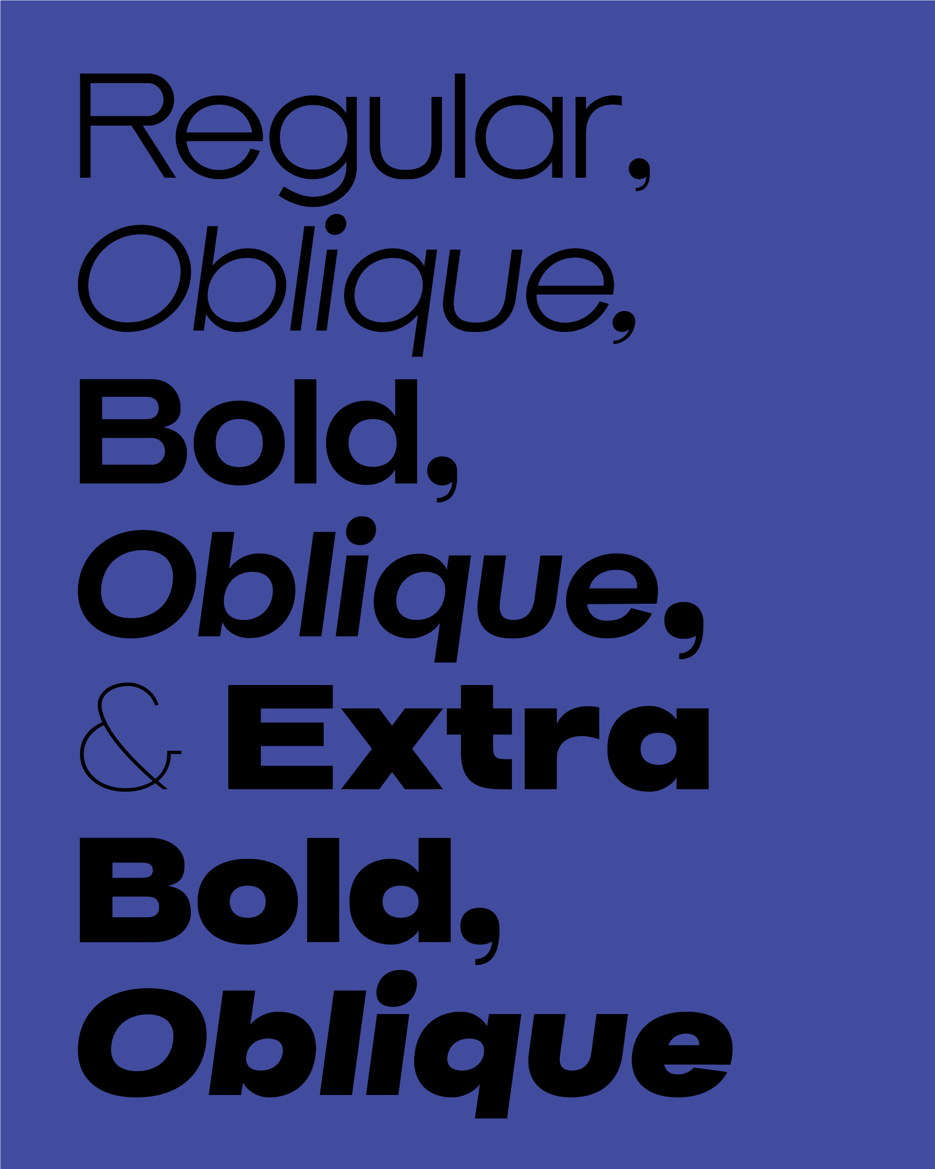
Introducing Pretend Foundry’s newest (and first) typeface*: Broad. Characterized by slightly extended character widths, low stroke contrast, tall x-height, short ascenders and descenders, it might be described as a geometric with grotesk undertones, or as a grotesk with geometric overtones.
Standard language support for all Latin characters as well as Oblique’s make Broad our most versatile release yet. Broad was inspired by the likes of Sackers, Trade Gothic, Antique Olive, Futura and Mies van der Rhoe’s Toronto-Dominion Centere signage to name a few.
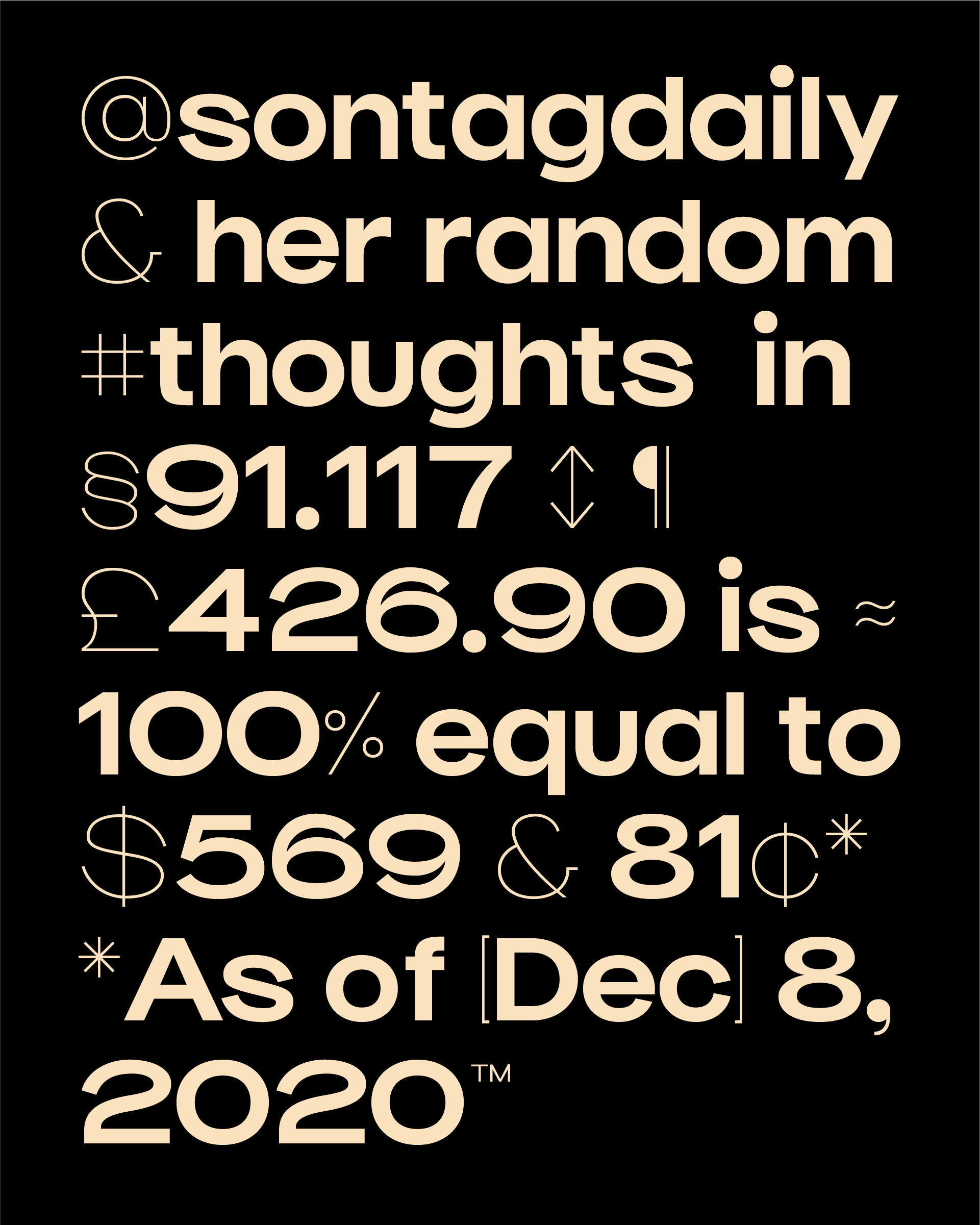
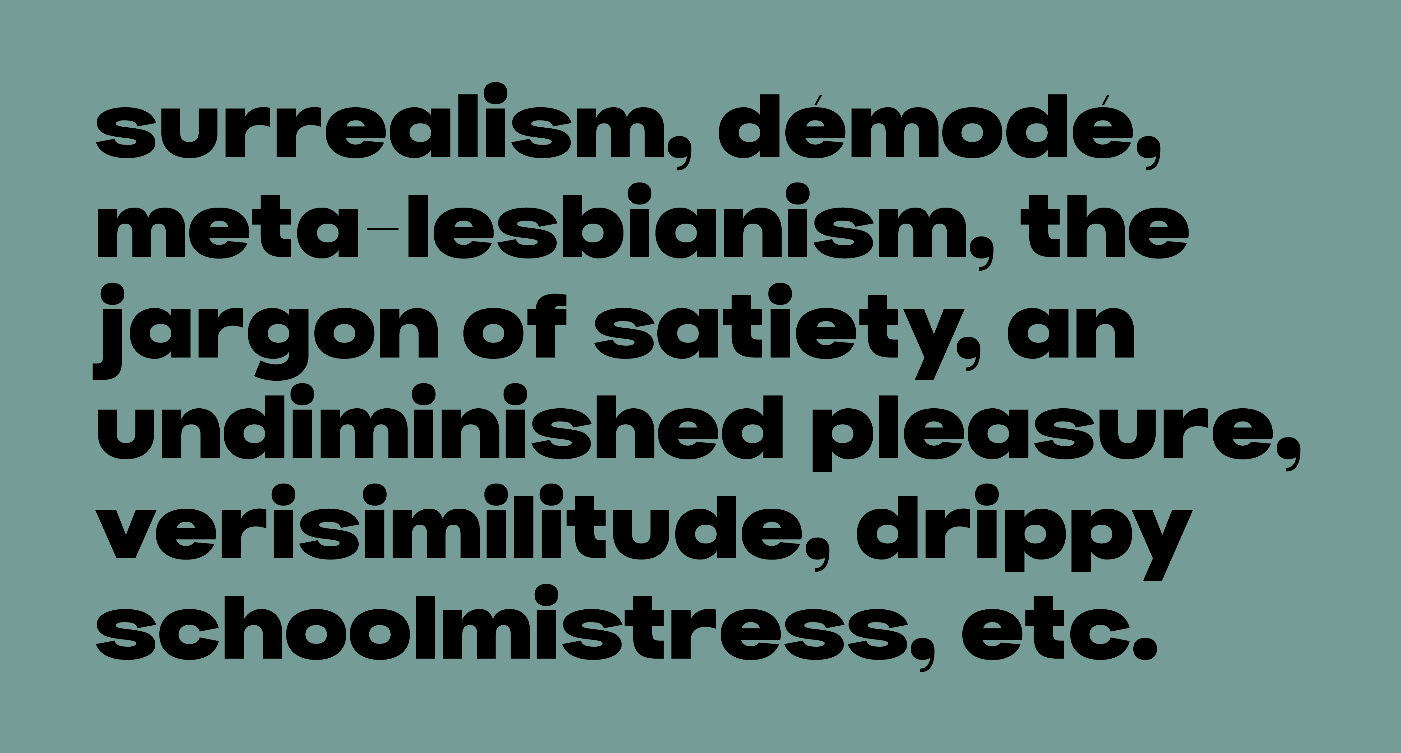
Broad’s ideal use is somewhere between a display and text. A pragmatic blend of versatility and irregularity. Meticulously hand drawn letterforms paired with super thin symbols (which is unified across all weights) and punctuation set make it a distinct option for a variety of applications.
*Not to get all technical but we all know that typeface refers to a family of fonts, as opposed to a single font.